To create an effective landing page that encourages membership sign-ups, focus on four key elements: clear focus, persuasive copy, considered design, and relentless testing. Without these elements, your landing page may fail to convert visitors into members.
Want to drive membership signups? Well-crafted landing pages are crucial. According to Hubspot, organizations with 30 or more landing pages generate seven times more leads than those with fewer than 10. That's not a stat to ignore.
A landing page is a specialized webpage designed for a targeted marketing campaign or to capture interest for specific search terms. It's the first thing users see when they click on a search result, email link, or advertisement.
The primary objective? To guide potential members toward a specific action—like signing up for your membership program, for instance.
So, how do you create a landing page that not only attracts but also converts without resorting to manipulative tactics? The formula involves a well-defined focus, compelling copy tailored to encourage membership, thoughtful design, and a commitment to ongoing testing.
Before you jump into the deep end of landing page creation, it's essential to establish a clear focus. Start by defining the value proposition for your membership program. This will serve as the foundation for all the elements that follow.
Define Your Membership Value Proposition
You've got a mere eight seconds to capture a visitor's attention when they land on your page. That's why nailing your value proposition right off the bat is crucial, especially if you're aiming to boost membership signups.
Think of your value proposition as a one-liner that packs a punch. It should be a concise sentence that spells out two things: the problem you're solving or the benefit you're offering, and how you're going about it.
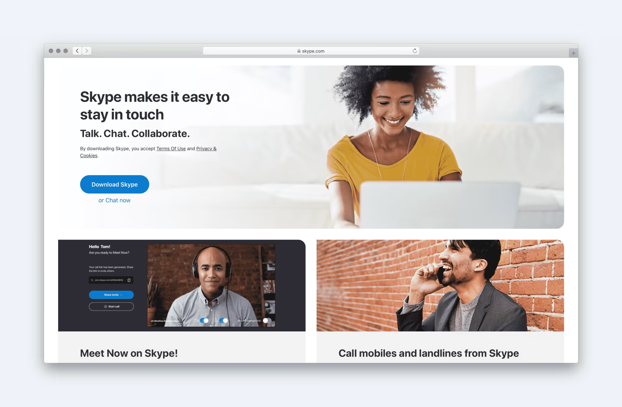
Take Skype, for instance. Their value proposition is:
"Skype makes it easy to stay in touch. Talk. Chat. Collaborate."
See what they did there? The first part tells you the benefit—making it easy to stay connected. The second part lays out how they deliver on that promise—through talking, chatting, and collaborating.
So, before you dive into the other elements of your landing page, get that value proposition down. It's the cornerstone for encouraging potential members to take the plunge.
Watch your step, though. It's all too easy for your value proposition to slide into the realm of the generic. Phrases like "best-in-class" or "friendly and approachable" are so overused they've lost their oomph. And let's be honest, they won't do much to encourage membership signups.
A quick litmus test to see if your value proposition is hitting the mark. Ask yourself if the opposite of what you've written would be absurd. For instance, if you say:
"We offer high-quality membership services at an affordable price."
The opposite would be laughable:
"We offer terrible quality membership services at sky-high prices."
See? You're basically stating the obvious.
On the other hand, if your value proposition reads:
"Our membership services are tailored to the housing sector."
The opposite holds water too:
"Our membership services are applicable to all"
Your value proposition isn't confined to just one sentence, by the way. Go ahead and jot down all the benefits your membership offers, along with the features that enable you to deliver those benefits. This will give you a fuller picture and help you craft a landing page that's genuinely compelling.
With that done, you can turn your attention to your calls to action.
Pinpoint Your Calls to Action
Every landing page needs a clear call to action (CTA), especially if you're aiming to boost membership signups. So, what's the action you want users to take?
Here's a pro tip: Keep it simple. Overloading your landing page with multiple CTAs will only dilute its focus and potentially confuse your visitors. For instance, asking people to follow you on social media might sidetrack them from your main goal—getting them to sign up for your membership.
However, it's often smart to have a secondary CTA. You'll have some visitors who are convinced by your landing page and ready to act, but others might still be on the fence.
Don't write off these hesitant users. Offer them a secondary CTA that demands less commitment. If your primary CTA is to sign up for membership, your secondary one could be something like subscribing to your newsletter.
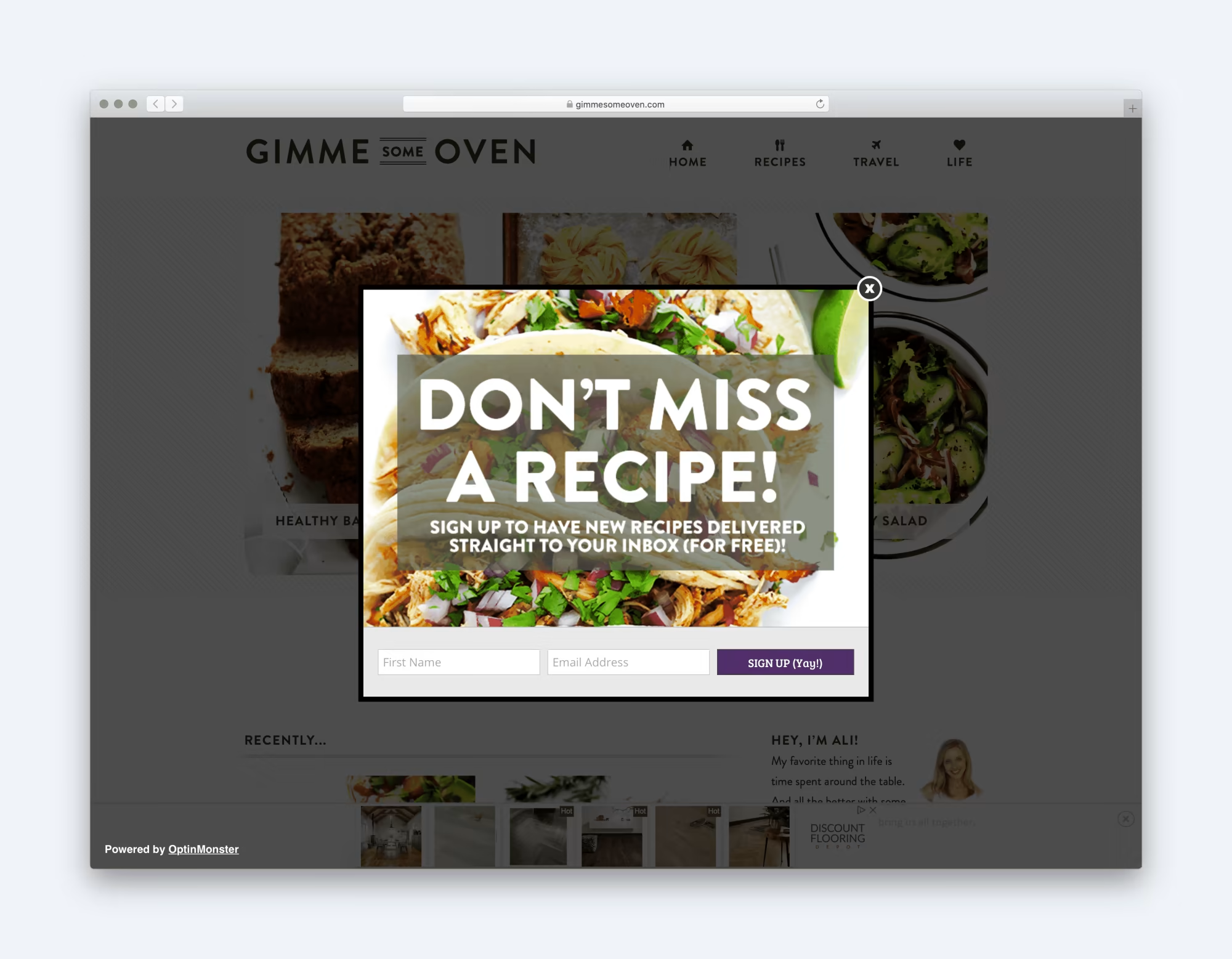
To keep this secondary CTA from stealing the spotlight, make sure it's less prominent. You could place it further down the page or use it as an exit-intent overlay. But tread carefully with popups; they can be a turn-off for some audiences and should be used judiciously.
Lastly, think about adding a little extra incentive to tip the scales in favour of action. Maybe offer a free e-book for those who join your mailing list or a special discount for signing up for membership via your landing page. Sometimes, a small perk like this can be the nudge people need to act now rather than procrastinate.
But let's be real—a freebie won't make a dent if other parts of your landing page are turning people off. That's where objection handling comes into play.
Tackle Objections Head-On
What's holding people back from taking action on your landing page? Are they balking at the idea of an annual fee, concerned about privacy, or maybe comparing your membership cost to competitors?
If you're scratching your head, unsure of what objections your users might have, it's time for a bit of user research. Don't fret—it doesn't have to be a massive, budget-draining endeavour.
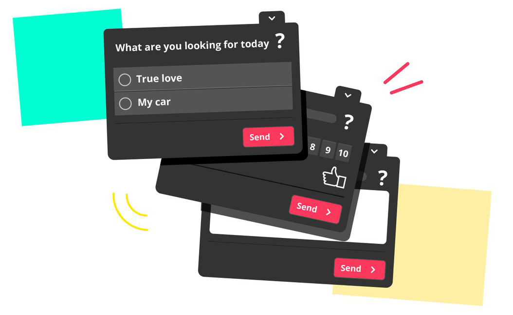
A simple one-question survey on your landing page can do wonders. As visitors are about to exit without taking action, hit them with this question:
"If you decided not to act today, it would be useful to know why."
Offer them a list of common objections to pick from, or let them add their own. This quick and straightforward approach can give you invaluable insights into what's stopping potential members from signing up. Once you know, you can tailor your landing page to address these objections head-on.
Once you've got a handle on why people are hesitating, it's time to address those issues head-on.
The best-case scenario is to eliminate the obstacle altogether. Offering perks like membership discounts or a money-back guarantee can go a long way in encouraging membership signups. But if that's not feasible, the next best thing is to tackle the objection directly in your landing page copy. Trust me, it's far better to confront an issue than to sweep it under the rug.
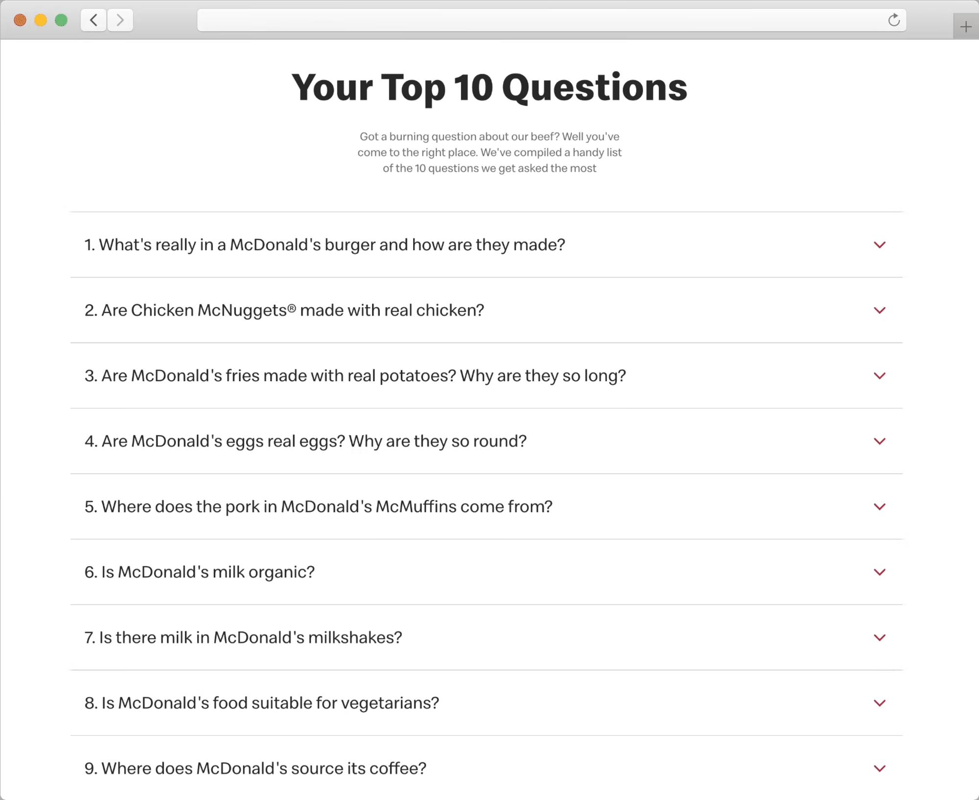
Take McDonald's, for example. They're well aware that some folks think their chicken comes from, let's say, less-than-ideal parts of the bird. Instead of dodging the issue, they tackle it straight up on their website.
So, as you refine your landing page to boost membership, keep these objections in mind. Whether you can remove the barriers or simply address them in your copy, being upfront about potential concerns can make your landing page more persuasive and effective.
There's one more nuance to consider when tackling user objections: timing and context matter. You've got to address concerns at the moment they're most relevant to the user.
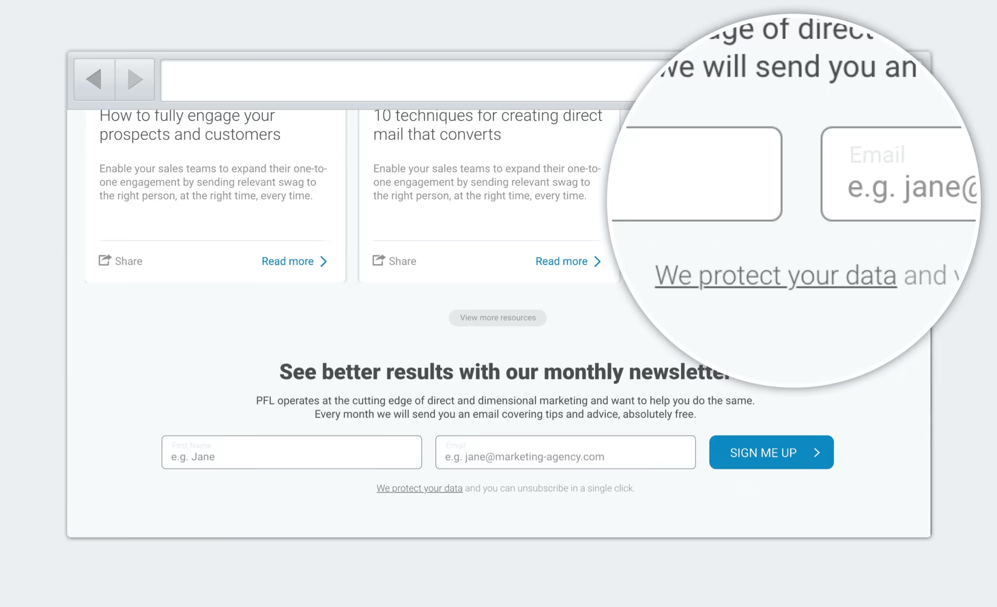
Take privacy and security, for instance. People aren't fretting about these issues while leisurely reading your privacy policy. No, they're thinking about it right when they're about to type in their email address on your signup form. That's the moment to reassure them about how you handle their data.
Don't expect users to go hunting around your site for answers to their concerns. If they can't find reassurance when and where they need it, they'll likely assume the worst and bounce.
So, as you're fine-tuning your landing page to encourage membership signups, remember to address objections not just clearly, but also at the right time and place. It's this attention to detail that can make or break your conversion rates.
You've laid out your offering and tackled objections, essentially winning over the logical side of your audience's brain. But let's not forget, decisions aren't made by logic alone. Now's the time to tap into the emotional aspect to really seal the deal on those membership signups.
Craft Your Brand Personality
A lot of our decision-making happens subconsciously. Research in the journal Behaviour and Information Technology reveals that people form an initial impression of a site in just 50 milliseconds. Thanks to the halo effect, these snap judgments tend to stick.
What this boils down to is that the look and feel of your site can heavily influence perceptions of your actual offering—even though the two aren't directly related. So, if you're aiming to boost membership signups, you've got to think about the impression your landing page makes at first glance.
Decide What Impression You Want to Make
Kick things off by jotting down a list of adjectives that encapsulate the vibe you want users to get when they land on your page. Some descriptors, like "trustworthy," will likely be universal. But others will be tailored to your specific audience and what you're offering in terms of membership.
Once you've got your list and your designer has whipped up a design aimed at conveying those attributes, it's time to put it to the test.
Put Your Design Aesthetics to the Test
If you've got multiple design options, a straightforward preference test can be really effective. Simply ask users which design they find more "approachable," for example.
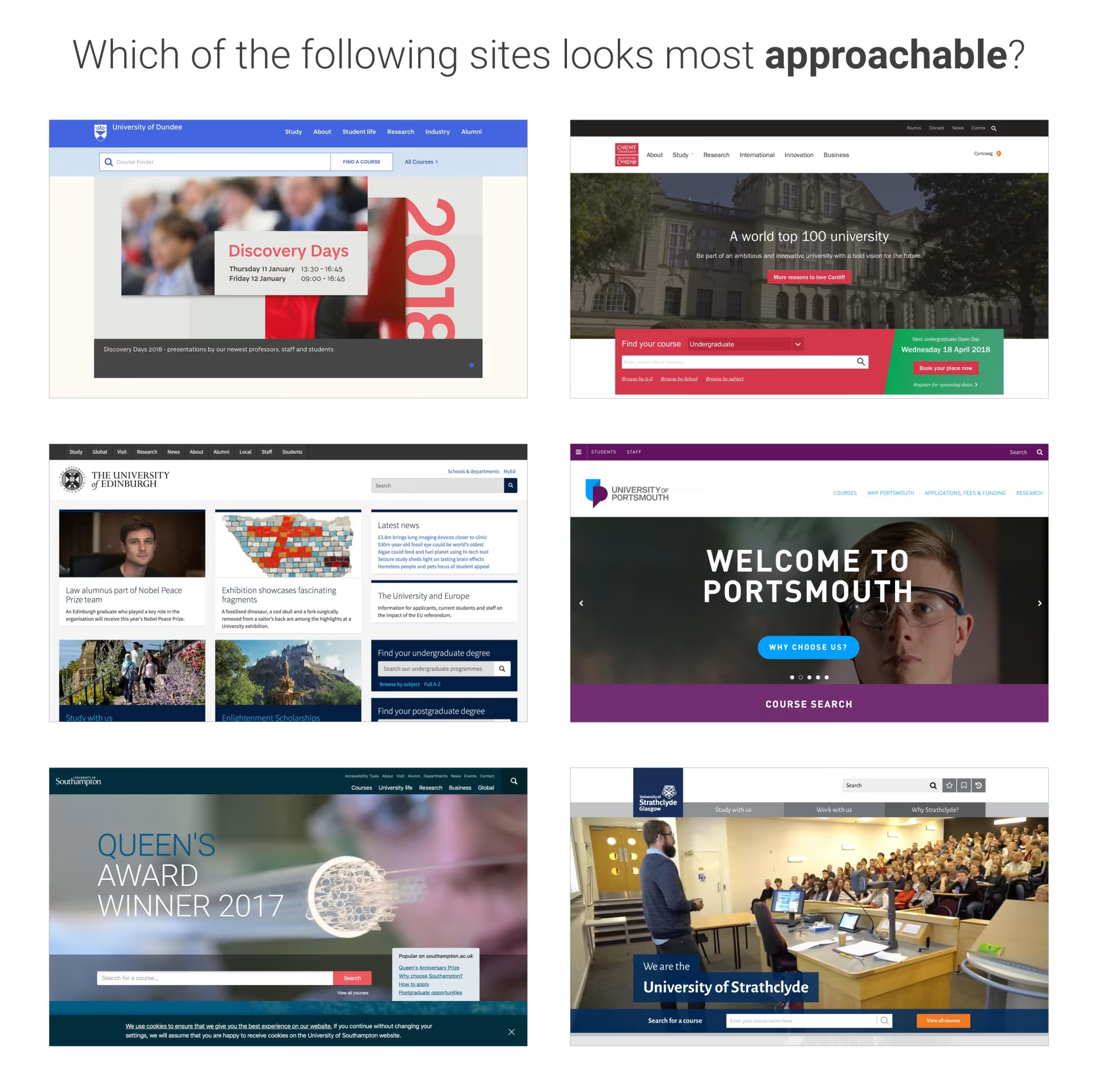
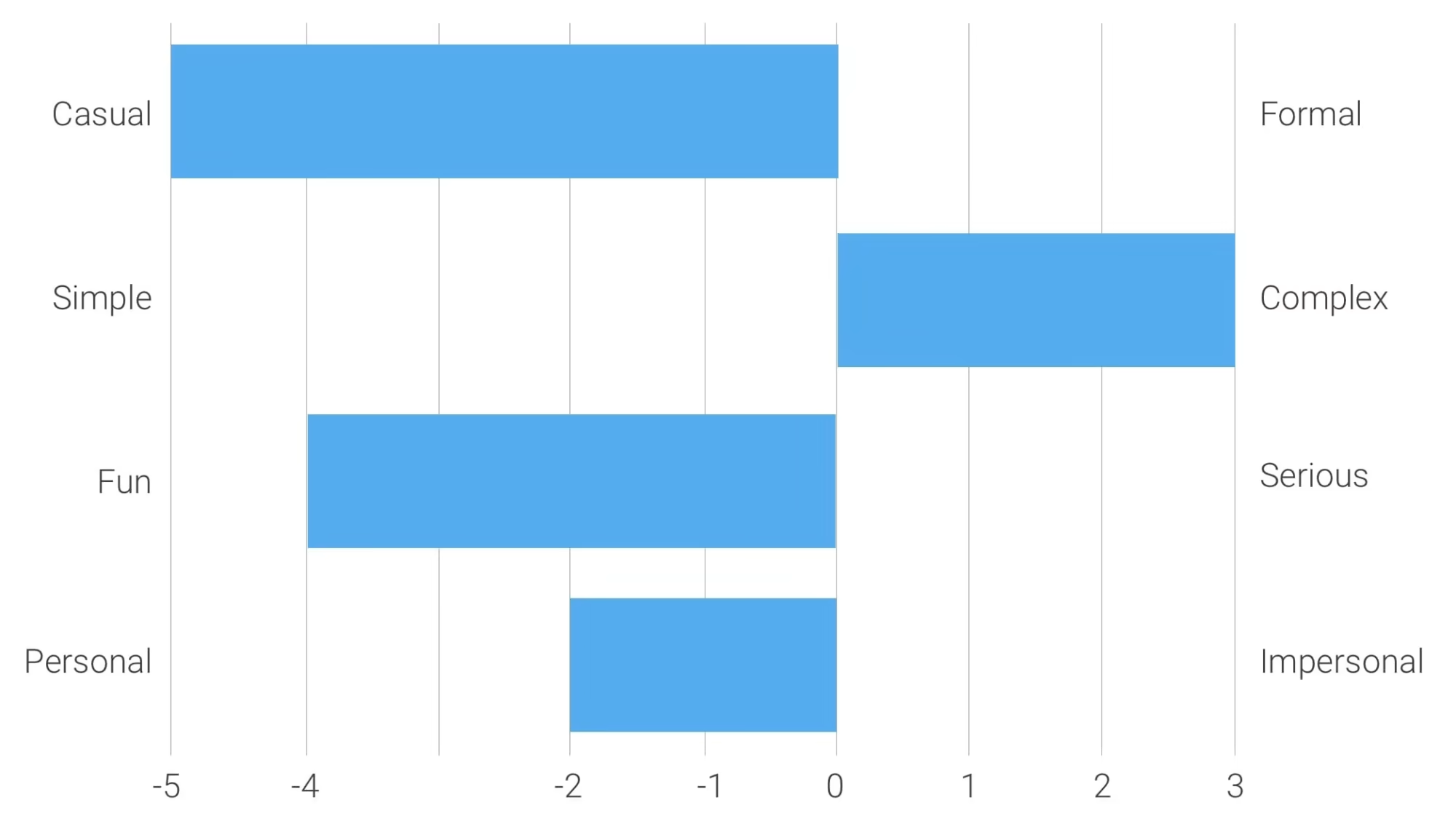
When you've got just one design, a semantic differential survey can do the trick. Here, you'd ask users to rate the design against your chosen adjectives. Is it "approachable" or "unapproachable"?
While aesthetics are crucial, they're not the be-all and end-all. Your visual hierarchy needs to be on point too.
Craft Your Visual Hierarchy
Nailing the visual hierarchy of your landing page is crucial for guiding users through the right information at the right time, without getting side-tracked by less important details.
Address the Right Questions at the Right Time
The first step is to make sure you're serving up the right info at the right spot on your landing page. To do that, you've got to get into the heads of your users, at least to some extent. While we can't know for sure what every individual is thinking, we can make some educated guesses based on typical user behaviour.
Generally, when someone lands on your page, they're subconsciously asking a series of questions, usually in this order:
- What's the offer here? (Value Proposition)
- How's that going to help me? (Benefits)
- How does this thing work? (Features)
- Can I trust this site? (Social Proof)
- What's my next move? (Call to Action)
Your visual hierarchy should reflect this flow of questions, at least broadly speaking.
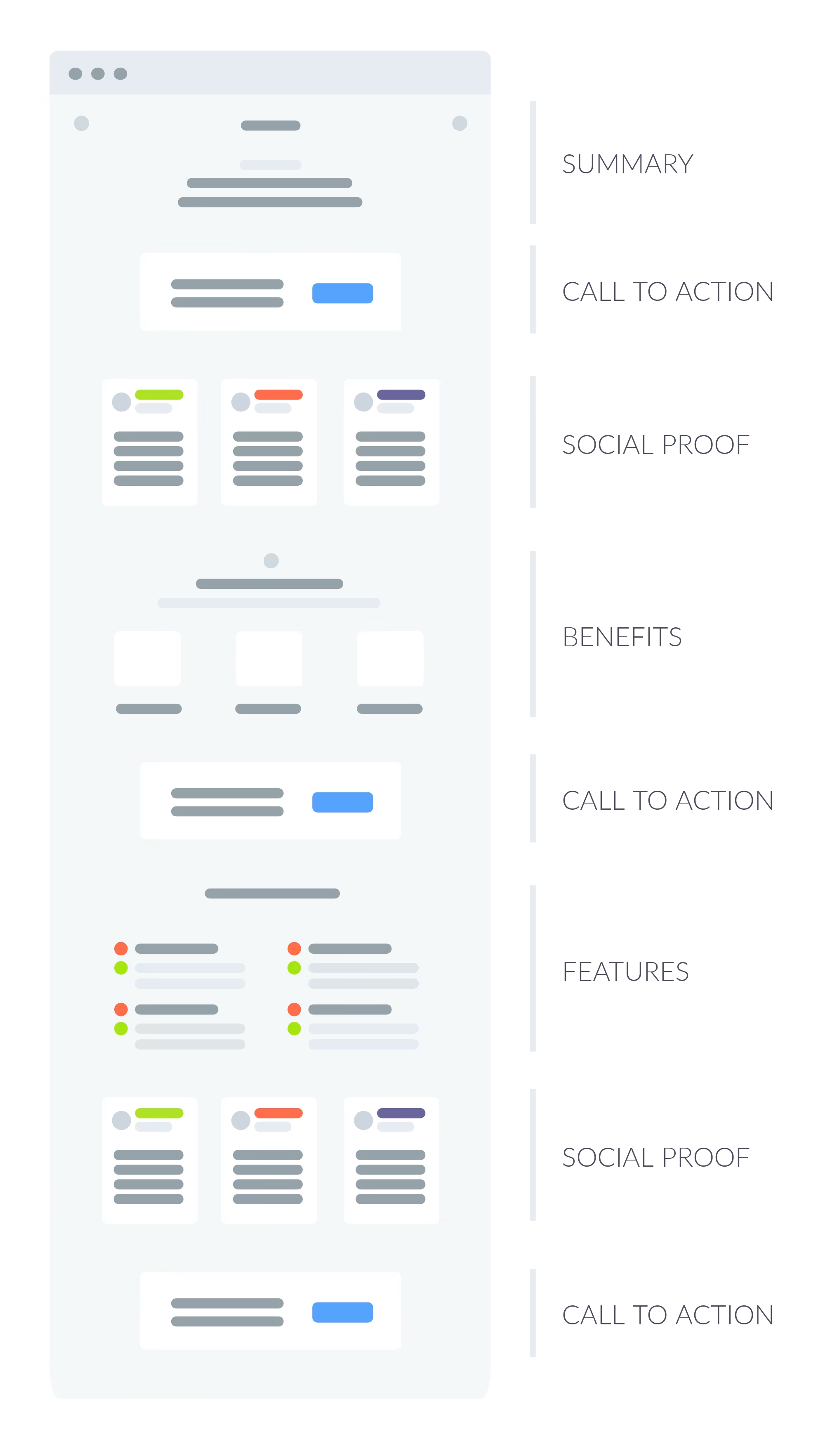
A Typical Landing Page Hierarchy
So, what might this look like in practice? Here's a rough outline:
- Value Proposition: Right at the top, clear and unmissable. This is your hook.
- Benefits: Just below or beside the value proposition. This is where you answer the "What's in it for me?" question.
- Features: Further down the page, after you've outlined the benefits. Here you get into the nitty-gritty of what your membership offers.
- Social Proof: Testimonials or trust badges can go here, offering that extra layer of reassurance.
- Call to Action: Finally, a clear, compelling CTA, encouraging users to take the next step and sign up for membership.
By aligning your visual hierarchy with the questions users are likely asking, you're setting up your landing page to be a more effective tool for driving those all-important membership signups.
Getting the content flow right is just one part of crafting a solid visual hierarchy. The other half is making sure that the most crucial elements on your landing page actually catch the user's eye.
There are several tools in your design toolbox to highlight key screen elements, such as:
- Positioning: Where something is placed on the screen can greatly affect its visibility. Prime real estate is usually at the top or center.
- Color: A contrasting color can make an element pop and draw the eye.
- Size: Bigger usually means more important in the user's mind.
- Imagery: A compelling image can grab attention and convey a message quickly.
- Animation: Used sparingly, animation can guide the eye to a particular element without being overwhelming.
- Negative Space: Sometimes, what you don't put on the screen is as important as what you do. Negative space can help focus attention where you want it.
But perhaps the most effective way to ensure users focus on what's important is by cutting out the clutter.
Streamline Your Interface
To really make your landing page effective, especially for driving membership signups, you'll want to simplify your interface. A systematic three-step approach can help you scrutinize every element on the page, from the logo down to the privacy policy link.
The Three-Step Simplification Process
- Remove: First, ask yourself, "Could I remove this element?" Consider the impact of its absence. Would the downside be greater than the cognitive load it adds to the page? If not, it's better off gone.
- Hide: If the element has value but isn't crucial for everyone, your next question should be, "Could I hide this element?" Options here include moving it to a sub-page, tucking it under a tab, or placing it in an accordion. This is a good strategy for secondary content that's useful for some but not essential for all.
- Shrink: If an element must stay visible but isn't a top priority, ask, "Can I shrink this element?" For instance, your cancellation policy might be important but not as eye-catching as your membership benefits. In this case, visually de-emphasize it to make it less prominent.
Once you've applied these steps along with other design techniques, you should have a landing page with a strong visual hierarchy that naturally guides users' attention to key elements like your calls to action. But don't just trust your gut—always test to make sure you've hit the mark.
Double-Check Your Visual Hierarchy with Testing
You've put in the work, but how can you be sure your visual hierarchy is hitting the mark? That's where the five-second test comes in handy. It's a quick and cost-effective way to see if users are actually focusing on the key elements you want them to.
How the Five-Second Test Works
The test is as straightforward as it sounds. Show users your landing page design for a quick five seconds, then take it away. Ask them what they remember. Tools like Usability Hub make running these tests a breeze.
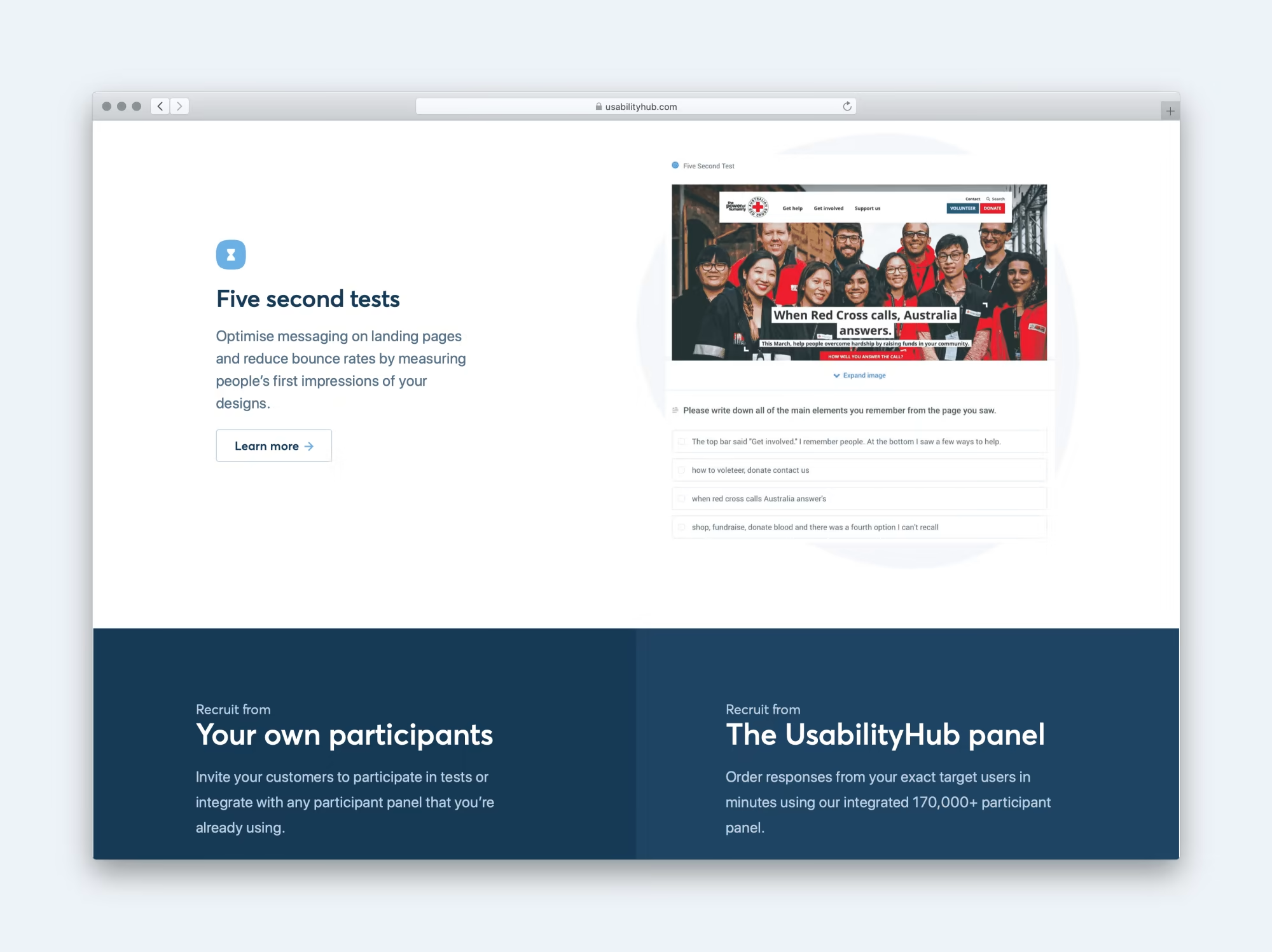
Why It Matters
The elements users recall, and the order in which they remember them, can give you valuable insights into the effectiveness of your visual hierarchy. Are they remembering your main call to action? Your value proposition? The benefits of signing up for membership? If so, you're on the right track.
And let's not forget, testing isn't a one-and-done deal. Even after your landing page is live and attracting visitors, ongoing testing is crucial for fine-tuning and keeping things optimized.
Keep the Cycle Going: Monitor, Iterate, Test
Let's be honest, nobody nails the perfect landing page on the first go. There's always room to tweak and improve, which is why ongoing testing is crucial even after your page is live and kicking.
Keep an Eye on User Behaviour
Once your landing page is up and running, tools like Hotjar or Microsoft Clarity can be invaluable. They allow you to monitor how users are interacting with your page in real time. Are they clicking where you want them to click? Are they scrolling past crucial information? This kind of insight can be a goldmine for figuring out what needs tweaking.
A/B Testing for the Win
For smaller changes—like a new headline, different imagery, or a colour switch—A/B testing can be your best friend. This lets you pit two versions of an element against each other to see which performs better in terms of driving membership signups.
Usability Testing for Bigger Changes
If you're considering more significant overhauls, usability testing is the way to go. Prototype your changes and put them through the wringer to see how they perform before committing to them fully.
The Never-Ending Cycle
At the end of the day, the key to a successful landing page is a continuous cycle of monitoring, iterating, and testing. It's this ongoing commitment to refinement that'll keep your landing page not just functional but also highly effective in converting visitors into members. So keep at it, and don't rest on your laurels.
How Heavy Penguin can help you
We have experienced user experience designers and strategy consultants that can help you with all the points discussed above.
We specialise in digital for the membership, charity and not-for-profit sectors in the UK.
Why not setup a virtual cuppa meeting with us to discuss how heavy penguin can help take the weight of your digital delivery.