One of the most costly mistakes made by organisations is to redesign a website every few years. In this post, we explore why that is the case and what you should be doing instead.
Who would have thought the government could prove a role model to us all? However, the work the UK Government Digital Service have been doing continually wins awards and more crucially enables the government to deliver better digital services for less.
Whether you are a not-for-profit, membership site or a commercial organisation, we all want to see the maximum possible return on our online investment. So what can we learn from the UK Government?
Well, if we look at their design principles which govern how they approach digital projects, the following jumps out:
The best way to build good services is to start small and iterate wildly.
In other words, they advise against designing a website, launching it and then only making the occasional update. Instead, they encourage ongoing improvements.
So, why do they make this recommendation?
Why Periodic Redesign is Bad for Business
The approach adopted by the UK government has become best practice as organisations move away from redesigning their website every few years.
The idea of periodic redesign is leftover from print media where making continual changes was cost-prohibitive. In digital, making changes is inexpensive, and we have unprecedented amounts of data to inform those changes.
So, let's look at why periodic redesigns are a terrible idea. We begin by looking at how wasteful they are.
Redesigns Are Wasteful
A significant problem with periodic redesigns is that they involve essentially starting a site again every few years. Yes, sometimes some of the content gets kept, and occasionally the underlying technology remains the same. However, even when that happens, the design is almost always scrapped.
No design is downright terrible, so it makes little sense to throw it out in its entirety.
Worst still, the redesign process itself is often wasteful. Organisations draw up specifications and commission websites based on little more than intuition. That usually means they end up developing functionality that the user doesn't want or need.
Then there is the fact that paying for that next significant redesign can prove painful for many businesses cashflow.
Redesigns Are Bad for Cashflow
Redesigning a website is a massive capital investment, which is why many organisations put it off long after it should have happened.
By contrast, if an organisation treats its website as an operational, rather than capital cost, then the level of investment would be much more manageable.
In other words, if organisations spent a little money regularly, rather than a massive lump sum every few years, they would ultimately spend less and have less of a burden on cash flow.
That would have another benefit too. It would ensure the website remained running at optimal performance.
Redesigns Leave Website Sub-Optimal
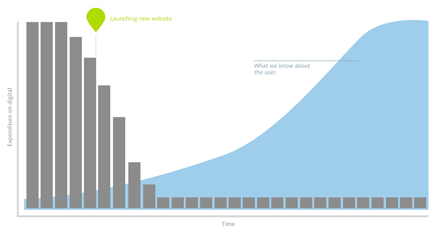
Another massive problem with periodic redesigns is that because the money dries up between redesigns, the sites remain mostly unchanged except for some minor content updates.

We learn more about user behaviour after launch than at any other stage. Unfortunately this is typically when the money dries up.
The result of this is that for most of the websites life, it is underperforming. In fact, towards the end of its life, it is often an embarrassment, which is what forces an organisation to do a redesign.
However, there is one final reason to avoid periodic redesigns, and that is, it could well alienate your repeat users.
Redesigns Reduce Repeat Visitors
People become used to things, and when you change that thing, they almost always react poorly, even if it is an improvement.
That is why every time Facebook redesigns its website; it inevitably causes an outcry and petitions demanding a return to the previous design.
While your users will probably not notice small incremental changes, a significant redesign has the potential to irritate existing users enough to encourage them to look elsewhere.
So, if redesigns are a terrible idea, what is the alternative?
Maximise Your Return on Investment Through Ongoing Iteration
Instead of periodic redesigns, make the next redesign the last one. Build a solid foundation for the long term and sustained growth of your website. Aim to build a foundation that you can incrementally improve over time. That is the same mindset recommended by the UK Government and the one that has become so prevalent in larger organisations.
Not that this requires building huge in-house teams or having massive budgets. Many organisations work with third-party partners on an ongoing basis, effectively turning the future investment in a redesign into a monthly retainer.
But working iteratively is not just about working on the website regularly. There are other differences too, such as starting with a minimum viable product.
Get to Market Faster With a Minimum Viable Product
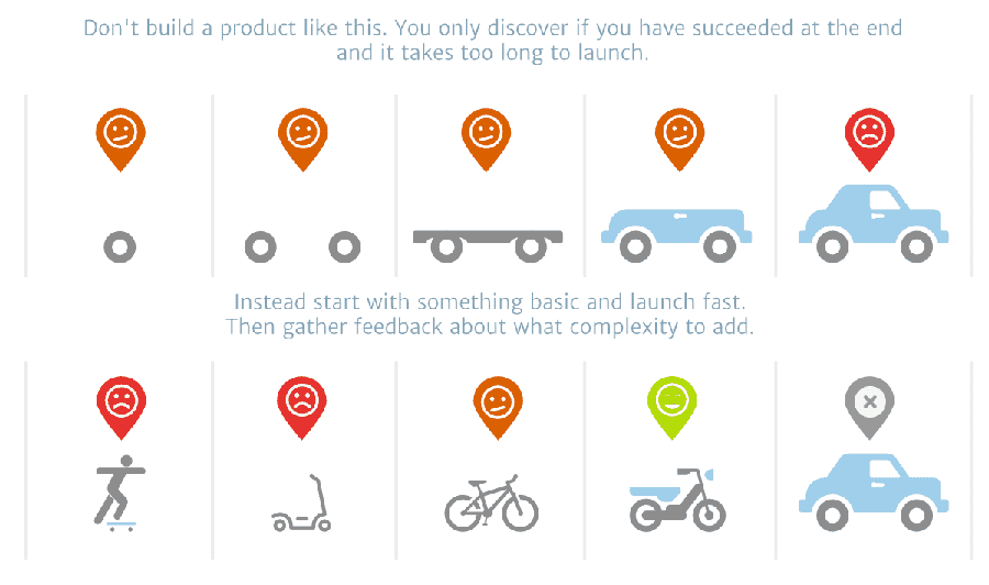
Too often, organisations miss opportunities because they agonise over creating the perfect website. They have to have every feature in place, and every piece of design and copy has to be crafted to perfection.
However, in reality, nobody knows what perfect is like until you put it into the world and see how people react.
Because with an iterative design approach you are not just releasing a site and then abandoning it, you can afford to launch a simpler version of your website and then add to it over time as you learn more. That is a minimum viable product, and it allows you to get something online much quicker.

A minimum viable product ensures that organisations build the right thing and avoids costly mistakes.
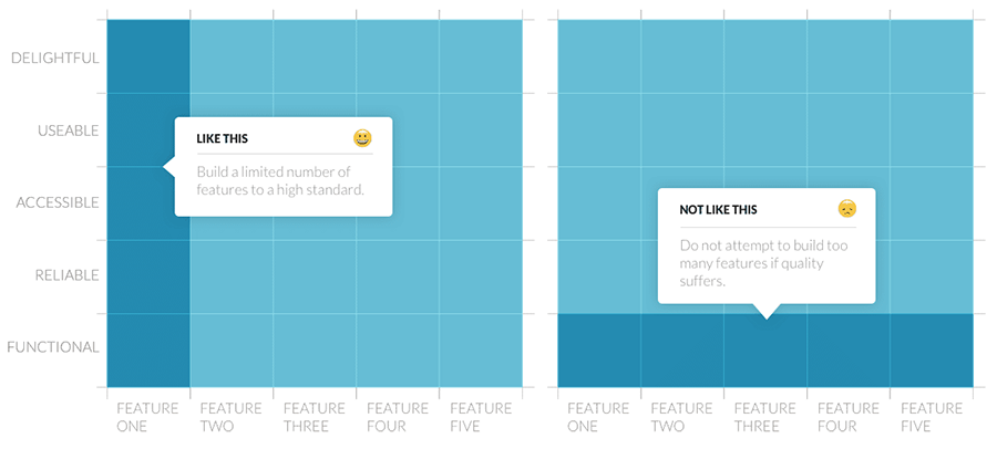
But do not misunderstand. I am not suggesting that what you release is poor quality. Organisations should design their minimum viable site to a high standard. Instead, it should merely be less comprehensive and more focused initially.

A mnimum viable product does not mean a poor quality website, merely a highly focused one.
You can then use data to inform what you add over time.
Make Better Decisions Using Data
As I have already said, too many decisions around website redesigns are based on intuition, but that is rarely reliable. Even after 25 years of working on the web, I am still surprised by what users will like or dislike.
Fortunately, digital provides us detailed insights into user behaviour incredibly quickly from session recorders like Hotjar to analytics such as Google.
By launching a minimum viable product and then watching the data, we can work out what is working and what is not, using that to inform where we should go next.
Not that our testing is limited to analytics or session recorders. It is possible to test everything from a design mockup to a headline using a variety of techniques from first-click tests to A/B testing
What the Cycle of Iteration Looks Like
So how does this all come together in practice? Well, it is an iterative cycle.
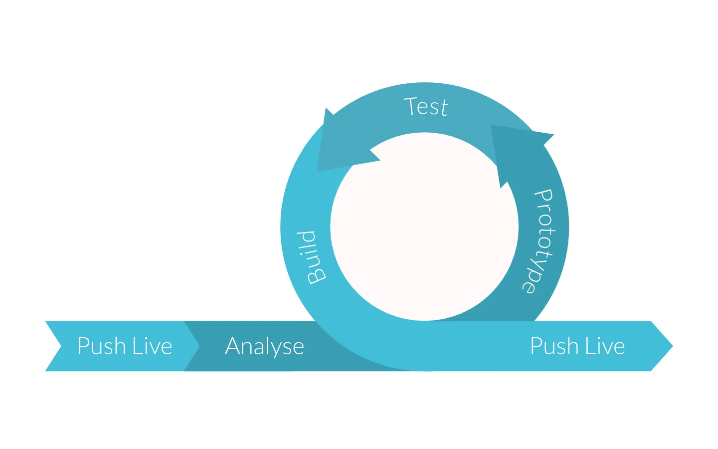
Once an organisation launches the initial version of their website, they start reviewing how it is performing and identifying areas for improvement. They prototype possible solutions to those problems, test them and, presuming they perform, push them to live. Then you look for the next area that needs improvement and repeat the process

A process of analysis, prototyping, testing and deploying will ensure your website improves over time.
While periodically redesigning your website leads to a gradual decline in site quality over time, this cycle of iteration creates ongoing improvement.
So, next time you consider hiring an agency to redesign your website, discuss the possibility of incrementally improving your site over time instead. If they look at you blankly, you know it might be time to talk to a partner who understands how to get the most from your site.