CASE STUDY

The IMI

Helping the IMI adapt and implement a Digital First approach

The IMI asked Heavy Penguin to come in and help them create a IMI Digital Strategy and roadmap. We combined this with an audit of their current technical landscape, all with the intention to help them become digital-first in their approach to membership and cement their position as the UK's leading governing body for the Automotive industry.

This study focuses on Phase 2 - to rebuild a new platform and CMS that would combine a proliferation of websites, reduce an overcomplicated sitemap, be more user-centric and allow editorial flexibility.

Visit website

The challenge.

After analysis and some discovery, it was clear the IMI needed a flexible CMS that could allow them to push the right content at the right times. They also needed a new modern platform that had the potential to scale in the future without costly development each time a new service was required. For a period of time, any new platform would need to run alongside existing architecture.

They needed a consistent brand across all websites, new information architecture and easier customer journeys. The site needed to be mobile-first. The performance had to be enhanced to try to stop high bounce rates.

The Solution.

The IMI, first and foremost, needed a Digital Strategy and some Design Principles. We helped them create these and then set out a 2-year Digital Roadmap. The first large project was to rebuild theimi.org.uk.

We carried out 8-week Discovery including UX Workshops around Audience Profiling, Business Goals and Lifecycles, Frustrations and Pain Points alongside Content workshops on Information Architecture, Workflows and finishing with Technical covering Integration, Architecture and Analytics.

The pre-existing platform was Drupal 7. Drupal offers great flexibility and security so we decided to stay with it and build a brand new website on the latest version of Drupal running on Acquia. Acquia gave us the opportunity to introduce new development practices with The IMI, including GIT repositories, automated builds, multiple test environments and build pipelines.

We created a brand new UI along with a style guide (Zeplin) and a custom reusable component library based on Foundation for Sites to help speed up the process.

  • Phase 1

    Discovery

    01

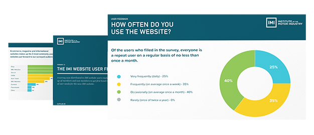
    Stakeholder interviews, customer feedback surveys and workshops made up the core of an 8 week, detailed Discovery phase with The IMI. Our experienced UX team gathered research and output to meet deliverables around Customer Journeys, Personas, Information Architecture and Content Strategy.

  • Phase 2

    Alpha

    02

    We carried out Tree Testing for the new sitemap on real users. We created Hi-Fi Wireframes and Prototypes using InVison and also tested any assumptions early on. The feedback allowed us to re-iterate, tweak User Journeys and finally produce a new style guide and visuals for theimi.org.uk.

  • Phase 3

    Beta

    03

    This is where everything came to life. After creating user stories from our earlier discovery work, our development team worked closely with UX and Delivery to plan a number of 2-week agile sprints. These were based on Epics from JIRA. We worked with other IMI development suppliers to integrate various data via API's. We then handed over a UAT environment to the IMI. After this Closed Beta was condcuted .

  • Phase 4

    Live & Support

    04

    After successfully completing a Closed Beta phase, final sign-off was given and we put into place our Go Live plan. This included due diligence around SEO and any third-party integrations. A very smooth launch gave The IMI confidence in us and by educating them around releasing little and often, they were aware this was just the first step on their journey to giving their members the best experience.

The results.

In April 2020, the new website was launched. The new platform brought together 4 separate websites, with future plans to increase this to 7. A new flexible UI and component library integrated into Drupal Layout Builder, means creating pages, news articles and events is easy. It's early days and we continue to monitor the website using Hotjar with Google Analytics and Tag Manager.

  • reduced amount of site pages by 92%
  • increased mobile traffic in first year by 68%
  • reduced page load times by 40% to under 3 seconds.
  • built an accessible website to WCAG 2.1 AA standards.
  • created a Progressive Web Application
  • fully responsive and built mobile-first
  • reusable code component library
  • shortlisted for Memcom 2021 Awards - Best Website

The feedback.

"We're thrilled with the outcome and can see how invaluable a detailed discovery phase was in terms of designing from a user perspective. With our new digital principles and a great new platform, we can develop and implement in an agile way with the user at the heart of every decision in future... "

Emma CarrigyDigital Project Manager - The IMI